North Carolina Based Creative Agency
Creative Web & Mobile Development
We deliver exceptional websites and mobile apps to grow your business.
Connect with Us
Our Services
We design and build digital solutions that help our clients grow.
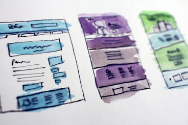

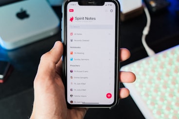
Latest Projects
This portfolio section showcases some of our recent work in web design and development.